RatingsArticle Archive |
A Conceptual Explanation of the Hot Hand "Fallacy"A few years ago, the hot hand fallacy was in the news because new research had come out supporting its existence. There was good technical information supporting this case, but I didn’t feel that any of the news articles written about the research provided a good straightforward explanation of the concept. So here is my explanation.
First, a little background: in simple terms, a group of researchers published a study in 1985 where they found that, on average, a player’s shooting percentage after making 3 consecutive shots was about equal to his normal shooting percentage. Because of this, they concluded that the “hot hand” is a fallacy. However, in 2015, two economists uncovered a mathematical mistake in their approach. They proved that if the hot hand were indeed a fallacy, counterintuitively, we would expect players’ average shooting percentages after a hot streak to be lower than their normal shooting percentages. To understand why, imagine that there is a player that shoots 50%, and every shot he takes is independent of his previous shots (for the purposes of this example, you could also just imagine flipping a fair coin repeatedly). This player will occasionally string together streaks purely by chance, but he doesn’t ever get hot or cold in the sense that a string of “hits” will make the next shot any more or less likely to be made than any other. If this player shoots 100 shots, the most common result is to have 11 instances where he will hit 3 consecutive shots, which will be considered a hot streak. Of course, he won’t always get exactly 11 hot streaks. In fact, he’ll only get exactly 11 hot streaks a little more than 8% of the time. 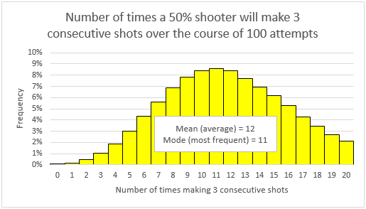
Take note that the above bell curve is skewed. The tail to the right is larger than the tail to the left. In fact, the tail to the right is big enough that the average number of hot streaks is 12, even though 11 is the most common. This skewness is going to prove to be a very important detail.
Because we are assuming every shot this player takes has a 50% chance of going in, and on average he has 12 hot streaks per 100 shots, then we can expect that, on average, 6 of those hot streaks will be followed by a hit, and 6 of those hot streaks will be followed by a miss. A typical series of 100 shots might look something like this: 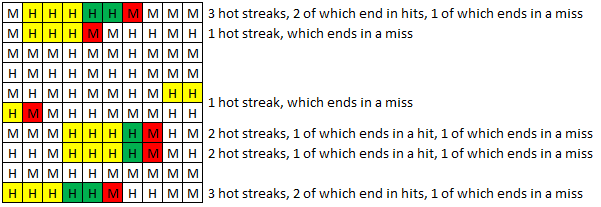
In the example above, over the course 100 shots, this player totaled 12 hot streaks. 6 were followed by a hit, and 6 were followed by a miss. But again, not every series of 100 shots will conform to the average. Just like the number of streaks over 100 shots forms a bell curve, the number of streaks that end in misses and the number of streaks that end it hits also form bell curves. But those two bell curves will not look the same. First consider the hot streaks that end in a miss. If the data were laid out like the image above, it will be represented by HHHM (hit-hit-hit-miss). Obviously, a stretch like that can’t overlap with other stretches of HHHM. Because they can’t overlap, it results in a relatively symmetric bell curve. The average number of instances of HHHM is 6, and 6 is also the most frequent number of instances. 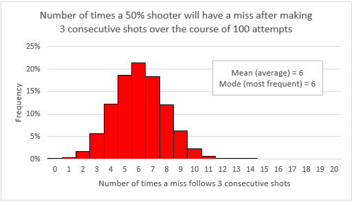
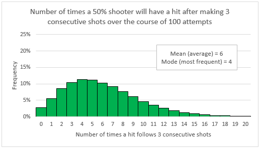
Now consider the hot streaks that end in hits. In the data, it will be represented by HHHH (hit-hit-hit-hit). If there is a hot streak that is longer than 4 hits, instances of HHHH will overlap with each other. This overlapping results in a feast-or-famine effect, where the bell curve is much more spread out and skewed. The average number of hot streaks that end in a hit is still 6, but 4 is the most frequent total number of occurrences over 100 shots.
Because the average number of streaks that end in a miss is 6 and the average number of streaks that end in a hit is 6, the ratio of the average is still 50:50. However, because the curve of steaks that end in hits skews low, a given stretch of 100 shots is more likely to have a low ratio than a high one. On average, this player’s shooting percentage after a hot streak will be about 46% over the course of 100 shots. Again, this is not because he shoots worse after a hot streak. It’s only because averaging ratios is the wrong mathematical approach in a situation like this.
Put simply: the ratio of the average is 50:50, but the average of the ratios is 46:54, and it’s all because the two bell curves have the same average but different shapes. This all proves that if the hot hand fallacy were indeed a fallacy, we would expect to see average shooting percentages after hot streaks to be lower than players’ overall averages. Because the study in 1985 analyzed the data in this way and found that average shooting percentages were about the same after hot streaks instead of being lower, they inadvertently provided evidence that undermined their conclusion. It took 30 years, but fortunately Joshua Miller and Adam Sanjurjo were able to find the truth: the hot hand is real. |
|
|